
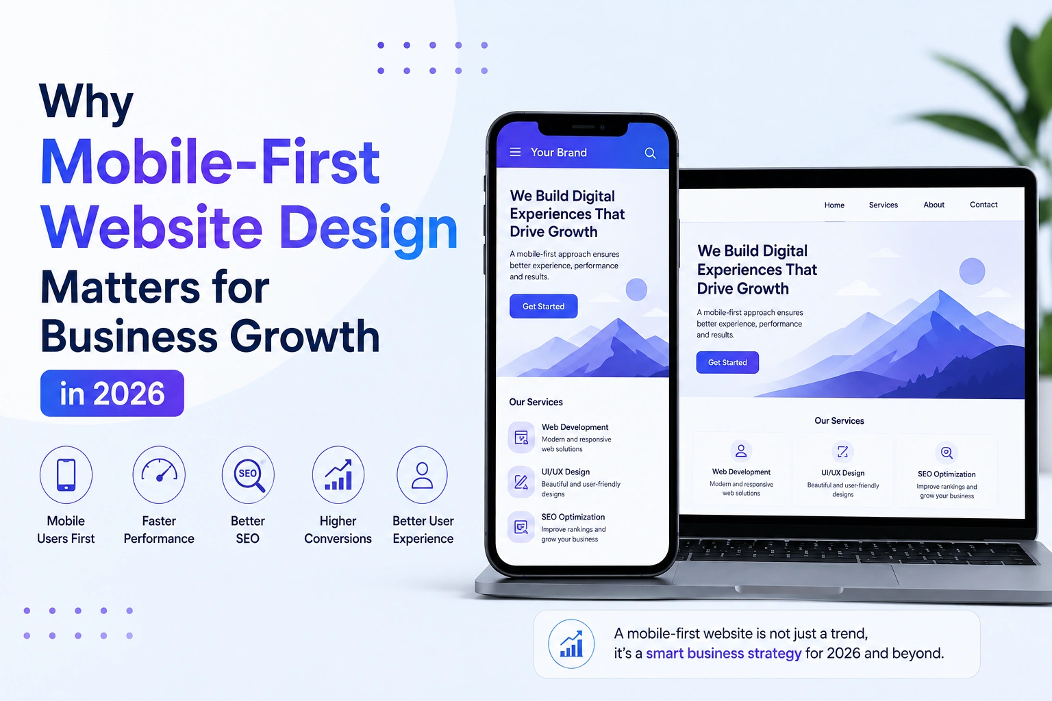
In 2026, having a website is no longer enough for businesses. With more people browsing, shopping, and interacting with brands through smartphones, businesses need websites that are designed with mobile users in mind from the beginning.
This is where mobile-first website design becomes important. A mobile-first approach focuses on creating a smooth and user-friendly experience for smaller screens first and then expanding the design for larger devices such as tablets and desktops.
What Is Mobile-First Website Design?
Mobile-first design means developing a website primarily for mobile devices before adapting it to larger screens.
Instead of designing a desktop website and then trying to make it responsive, developers start with the most important content and features for mobile users. This approach helps create a cleaner, faster, and more focused experience across different devices.
Why Is Mobile-First Design Important in 2026?
1. More Users Browse on Mobile Devices
Smartphones have become one of the primary ways people access the internet. Whether users are searching for a service, reading a blog, comparing products, or making a purchase, they expect websites to work smoothly on their phones.
A mobile-friendly website allows businesses to reach customers wherever they are.
2. Better User Experience
A website that is difficult to navigate on a smartphone can quickly frustrate visitors.
Mobile-first design focuses on:
- Easy navigation
- Readable text
- Touch-friendly buttons
- Simple layouts
- Properly optimized images
- Fast-loading pages
When visitors can easily find what they need, they are more likely to stay longer and interact with the business.
3. Improved Website Performance
Mobile users often browse on cellular networks, where loading speed can vary. A mobile-first approach encourages developers to prioritize essential content and optimize website assets.
Optimizing images, reducing unnecessary scripts, using efficient code, and improving page structure can help create a faster browsing experience.
4. Supports SEO Performance
Search engines consider mobile usability and website performance important factors when evaluating websites.
A responsive, fast, and easy-to-use website can provide a better experience for both users and search engines. Businesses should therefore consider mobile optimization as an important part of their overall SEO strategy.
5. Higher Conversion Opportunities
A good website should not only attract visitors but also encourage them to take action.
Whether the goal is to:
- Purchase a product
- Submit a contact form
- Book a service
- Request a quotation
- Call a business
- Subscribe to a newsletter
a mobile-friendly experience can make these actions easier.
Simple forms, clear calls-to-action, and easy checkout processes can help reduce friction and improve conversion opportunities.
Key Elements of a Mobile-First Website
A successful mobile-first website should focus on more than simply shrinking a desktop layout.
Important elements include:
Responsive Design: The website should automatically adapt to different screen sizes.
Fast Loading: Images, scripts, and other resources should be optimized for better performance.
Simple Navigation: Users should be able to find important pages without unnecessary clicks.
Readable Content: Fonts, spacing, and layouts should remain comfortable to read on smaller screens.
Touch-Friendly Interface: Buttons and interactive elements should be large enough and properly spaced for touch navigation.
Clear Calls-to-Action: Important actions should be easy to find and use.
Mobile-First Design and Business Growth
A well-designed mobile experience can directly support business growth. When visitors have a positive experience, they are more likely to explore products or services, trust the brand, and eventually become customers.
For eCommerce businesses, this is particularly important. A smooth mobile shopping experience—from product discovery to checkout—can help reduce abandoned purchases and improve customer satisfaction.
Final Thoughts
In 2026, mobile-first website design should be considered a business priority rather than an optional feature. A website that loads quickly, works smoothly, and provides a simple experience on smartphones can help businesses improve user engagement, strengthen their online presence, and create more opportunities for conversions.